The case against heatmaps
Visualised aggregations of click activity are a low effort, low signal waste of time and best avoided in favour of actual research
Illustration by @popiumworks
Heatmapping has become a standard part of the website optimisation toolkit. Full Story, Hotjar, Crazy Egg and umpteen other UX optimisation tools offer it as a part of their packages. It’s easy to get started, too. You install the script on your site, check back a few days later and... it's ready! You now have colour coded Rorschach aggregations of click activity. Where did people click? Where didn't they click? Now you know.
Heatmaps seem robust and authoritative. They look cool and they add a sheen of data driven credibility that you can use to support your design decisions. But they are rarely actually useful. And what's more, they're a shallow proxy for the more revealing yet more involved research methods that they risk supplanting.
Clicks don't mean anything
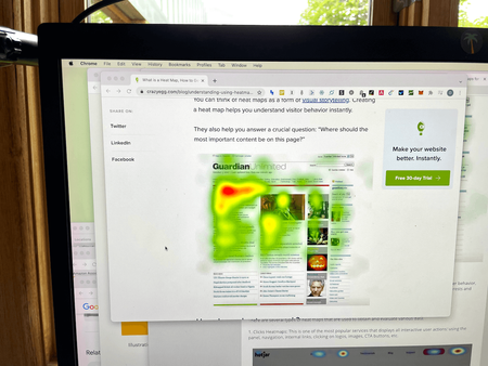
One of the purported benefits of heatmapping is that it helps you to understand the content that your visitors engage with the most. Some vendors go further than this and suggest that it’s a low cost substitute for eye tracking. No need for a fancy research lab crammed with high tech gear or even any living, breathing human participants! Crazy Egg go further still and claim to collect almost twice as much data as ‘traditional’ eye tracking.
Crazy Egg heatmap lets you collect more than 88% of the data you would using a traditional eye-tracking process. At a fraction of the price. With no hardware. Almost no IT involvement. And no strings attached.
88% ya say? Let’s pause for a moment to allow that spuriously precise yet factually vacuous data point to wash through your cranium for a second.
Ready to push on? OK.
Unfortunately, studies suggest that clickmaps bear little resemblance to eye tracking data. Even if they did... do we even care about eye tracking to begin with? Now, I’m open to being wrong on this one but for the moment, I think that we do not.
Because an element on the page gets attention and engagement does not mean that it’s important. Clicks do not mean that an element is problematic, good or bad or anything else. Clicks are only a reflection of the visual hierarchy of the page. People click on what’s in front of them, not necessarily what’s important to them. That could be buried elsewhere and with heatmapping, it'd take a lot of guesstimation and trial and error to actually find out.
The typical narrative around heatmaps is that you use them to understand user behaviour and inform design decisions. Crazy Egg (I don’t mean to pick on them, but they don’t make it easy) says:
A heatmap is an easy way to understand what users want, care about and do on your site by visually representing their clicks - which are the strongest indicators of visitor motivation and desire.
Now, if UX were medicine (hear me out) this statement would have Crazy Egg hauled into a committee hearing and stripped of their right to practise. This is hokum. Far from being the “strongest indicators of visitor motivation and desire,” heatmaps tell you only what people click on. This is rarely enough to shine a light on basic usability issues, let alone the innermost thoughts and feelings of random, anonymised people who… clicked on stuff (or not!)
Not to mention that the data can be fairly nebulous. Clickmaps are a relic of a pre-responsive era and get vastly more complicated when you account for the nature of today's web. To calculate the X, Y position of a click on the page, your heatmapping tool needs to silo all the individual datasets so that you can only view aggregated heatmaps for each of the thousands of responsive breakpoints in which your site was viewed. Bummer. Let's not even get started on dynamic single page web applications in which element locations can be different for every user at different times.
Analysis is a nightmare
If clicks in isolation don’t tell us anything useful, what do we do with aggregated visualisations of clicks from hundreds or thousands of users? We get an image with an impressive, scientific appearance but which offers no clear direction or guidance on what to do next.
OK, people are clicking on stuff. What now?
There are a handful of useful applications for clickmap data. Sometimes, you will see people clicking on things that aren't actually links, for instance. But in most cases, heatmaps raise more questions than they offer solutions. How many times have you sat down to analyse a heatmap and felt confident about what to do next? For me, the answer is rarely, if ever.
In the absence of clear direction, people will tend to build out an interpretation of the heatmap to fit the problem they already perceive to exist. In the words of David Ogilvy, they'll use research "as a drunkard uses a lamp post, for support, rather than for illumination".
Analytics and user research offers a much better alternative
Heatmaps do have a place, of course. They can be useful to explain interactions and navigation paths. For new and unsophisticated optimisers, it’s easier to understand a visual representation of clicks than it is to consult analytics. But they do not come close to offering the rich level of insight that you can find elsewhere.
So much of what heatmapping promises can be found with more detail in even the most basic analytics implementation. Event tracking and conversion goals offer even further scope for understanding user behaviour, which you can then filter and break down six ways from Sunday. If you want to uncover the motivations and desires of your customers, though, you'll have to actually talk to them.
Just a few user research sessions will generate only oodles of ideas and hypotheses but also some priceless facepalm moments. A heatmap image can’t compete with this level of insight. Yes, user research can be tedious and time consuming work. Dealing with actual humans (in the midst of a pandemic, no less) is more challenging than installing a script on your site and letting it tell you what to do.
I suspect that this difficulty explains the continued existence of heatmapping. Much like covering the walls of your office with coloured sticky notes, heatmaps offer an attractive visual artefact that says “UX” and “research” in a way that is both appealingly effortless yet, to outsiders (i.e. bosses, clients, coworkers), imperceptibly different from actual research.
For businesses that don’t have a mature analytics implementation or any experience undertaking qualitative research, I understand how heatmapping can seem appealing. But like microwaving a steak, the ease and convenience sound great in principle but the results are sorely lacking in practice.
Thanks to David Mannheim for some useful insight that helped me clarify my thoughts on this post.